PROJECT
Q&ME SURVEYS
Q&Me Surveys is a mobile survey app that operates nationwide in Vietnam. The app allows users to earn rewards by completing questionnaires which are distributed based off profile demographics.

Q&Me Surveys is a mobile survey app that operates nationwide in Vietnam. The app allows users to earn rewards by completing questionnaires which are distributed based off profile demographics.
January 2020 - March 2020
UX/UI Design • User Research • Design Handoff • Design Strategy
Adobe Creative Cloud • Figma
Competitive Analysis • User Personas • POV Statements • Information Architecture • Wireframes • Mockups • Prototypes • Style Guide
Kengo Kurokawa • Melody Tran • Binh Luc • Nhan Nguyen • Trau Nguyen • Linh Le • Huyen Bui
Designed and developed by Asia Plus Inc., Q&Me Surveys serves as an in-house data gathering tool for use in the company's bevvy of market research services. The founder's aim was to innovate how Vietnam conducts market research by creating a digital data-collecting platform, shifting away from more traditional research methods.
The mobile app was originally designed by a graphic designer and launched in 2014. It had the benefit of leveraging a consumer landscape that was quickly modernizing and moving online, and with the prospect of being able to earn rewards from anywhere and at any time, Q&Me Surveys was appealing to a population that was eagerly adopting mobile technology despite the app's glaring design flaws.
By 2020, Q&Me Surveys struggled to convert new users and grappled with a declining user base. Originally created with little consideration for UX fundamentals, the app was laden with inconsistencies and convoluted flows which discouraged people from investing their time into what was supposed to be a rewarding experience. As its audience continued to evolve and the marketplace steadily matured, a wholly unchanged Q&Me Surveys app had remained stagnant.


Our challenge was to reinvigorate Q&Me Surveys, working towards laying down a strong foundation while embracing the app's original premise of empowering users to earn redeemable points by completing tasks. In doing so, we were striving to create an engaging experience which would be refreshing for the app's current user base, enticing for those who had come and gone in the past to give it another shot, as well as offering a dash of familiarity and simplicity to welcome future generations of user.
The business goals were to:
• Bring a modern, eye-catching look to the app
• Motivate users to return
• Improve NPS to drive in new users
• Increase the database of active panelists
Our high-level goals were to:
• Create an environment for deeper engagement
• Make it fun and intuitive to use
• Build and establish trust
• Create a community where people could interact with one another
As the project's sole designer, I was responsible for leading the experience and visual design of Q&Me Surveys. During the app's redesign process, I worked alongside a product manager, two researchers, and four engineers in an agile environment.
Designed and developed by Asia Plus Inc., Q&Me Surveys serves as an in-house data gathering tool for use in the company's bevvy of market research services. The founder's aim was to innovate how Vietnam conducts market research by creating a digital data-collecting platform, shifting away from more traditional research methods.


Lorem ipsum dolor sit amet, consectetur adipiscing elit. Vestibulum vitae ipsum nec lorem porttitor rhoncus vitae sit amet neque. Fusce non dolor ligula. Nullam at venenatis augue. Etiam lorem tellus, sodales vel pretium id, egestas vitae libero. Donec accumsan, lectus ut molestie tempor, libero nisl faucibus elit, porta lacinia ex elit quis dolor.
• Maecenas ut elit sapien
• In sollicitudin mauris eget nisl blandit
• Donec id sapien sodales
• in dignissim tortor ullamcorper ve
The initial step in our research entailed analyzing similar products in the market and understanding the strategies and patterns they employed. We examined the good and bad aspects of five different products to explore ideas for how we could add value to our own product.
The points of focus were:
• Onboarding experience
• Content presentation
• Rewards system
• Features
Naturally, with Q&Me Surveys acting as a data gathering tool, sending out surveys to current users was a quick and cost-effective initial research approach. For this method, I collaborated with our researcher Melody to explore the viability of different aspects in the app's current rendition. By sending out questionnaires, our goals were to quantify how the current look and feel impacted users' perceptions, feelings, and experiences when using the app.
Key findings from the surveys
92% of respondents felt the visual aesthetics of the app were old-fashioned and far behind that of modern apps.
86% of respondents felt the presentation of content and how it was displayed made the app look cluttered and feel convoluted.
83% of respondents felt that a major update to the visual design would entice them to open the app more frequently.
78% of respondents felt the current use and placement of icons were not helpful in conveying features, functions, and actions.
of respondents felt the visual aesthetics of the app were old-fashioned and far behind that of modern apps.
of respondents felt the presentation of content and how it was displayed made the app look cluttered and feel convoluted.
of respondents felt that a major update to the visual design would entice them to open the app more frequently.
of respondents felt the current use and placement of icons were not helpful in conveying features, functions, and actions.
To gain further insights and really delve into uncovering the pain points users were experiencing as well as their needs and goals, we interviewed six current users in addition to six users who had never used the app before. For this phase, I worked with both our researchers in creating the interview questions and curating the process, but it was our researcher Huyen who conducted the interviews.
The goals of the interviews were to:
• Uncover the barriers discouraging people from signing up
• Understand the needs, goals, and motivations that propel people to use the app
• Understand the challenges and pain points users are experiencing
With the data gathered through our user research, we identified overlapping themes among the different user groups. I created personas to take a deeper dive into understanding our users and how to meet their needs.


While the numbers from the surveys largely indicated fundamental shortcomings that mainly stemmed from the app's visual design, the findings gained from the user interviews painted a deeper picture into the frustrations people were facing as they worked towards completing tasks and reaching their goals.
User insights

• To have consistent ways of accumulating points
• To easily share interests and experiences
• To feel comfortable in sharing information
• To efficiently manage activities and submissions

• To receive and make use of earned rewards
• To explore the thoughts and voices of people
• To establish a source for a financial boost
• To be entertained and have fun

• Having more money to spend on other things
• Free and easy to do from home
• Doesn't require experience or specific skills
• To pique curiosity on different topics and subjects

• Completing activities but not receiving points
• Registration process is long and strenuous
• Lack of surveys and updates
• Difficult to scroll through and read content
After synthesizing the findings gained from our users, the final step in our research entailed analyzing similar products in the market and understanding the strategies and patterns they employed. We examined the good and bad aspects of five different products to explore ideas for how we could address the frustrations that our users were facing, as well as identifying gaps to help us add value to our own product.
The points of focus were:
• Onboarding experience
• Content presentation
• Rewards system
• Features


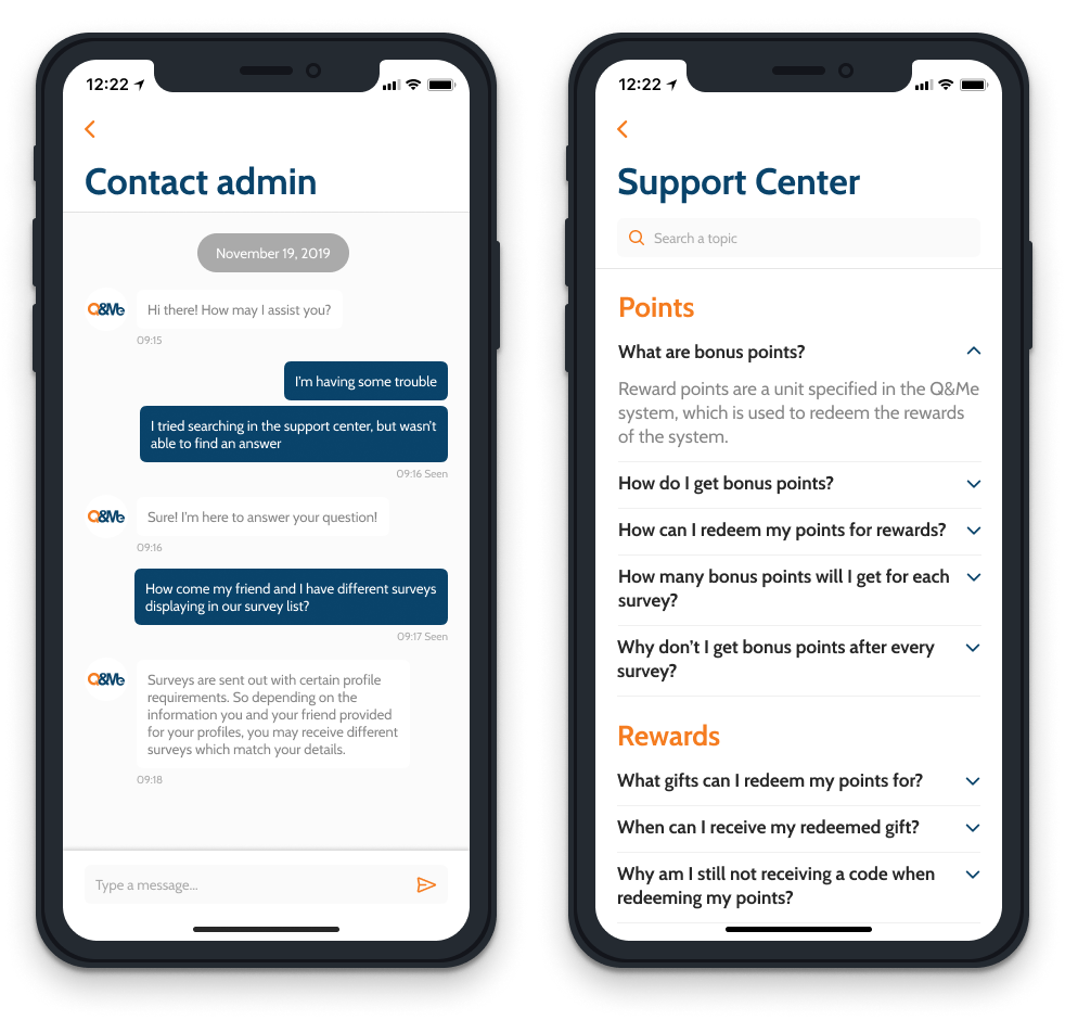
From tackling the registration process to attempting to receive a reward, and everything else in-between, the Q&Me Surveys app experience is riddled with communication issues and dubious design elements, leading to disengagement, frustration, and people questioning the legitimacy of the operation.
Once we were able to formulate a more defined problem, we explored possible solutions by asking ourselves:
"How might we redesign the online survey experience to help reinvigorate people's confidence and engagement?"
Lorem ipsum dolor sit amet, consectetur adipiscing elit. Vestibulum vitae ipsum nec lorem porttitor rhoncus vitae sit amet neque. Fusce non dolor ligula. Nullam at venenatis augue. Etiam lorem tellus, sodales vel pretium id, egestas vitae libero. Donec accumsan, lectus ut molestie tempor, libero nisl faucibus elit, porta lacinia ex elit quis dolor.
• Maecenas ut elit sapien
• In sollicitudin mauris eget nisl blandit
• Donec id sapien sodales
• in dignissim tortor ullamcorper ve
• Create an environment for deeper engagement
• Make it fun and intuitive to use
• Build and establish trust
• Create a community where people could interact with one another


• Create an environment for deeper engagement
• Make it fun and intuitive to use
• Build and establish trust
• Create a community where people could interact with one another


• Create an environment for deeper engagement
• Make it fun and intuitive to use
• Build and establish trust
• Create a community where people could interact with one another


• Create an environment for deeper engagement
• Make it fun and intuitive to use
• Build and establish trust
• Create a community where people could interact with one another
• Create an environment for deeper engagement
• Make it fun and intuitive to use
• Build and establish trust
• Create a community where people could interact with one another


• Create an environment for deeper engagement
• Make it fun and intuitive to use
• Build and establish trust
• Create a community where people could interact with one another
• Create an environment for deeper engagement
• Make it fun and intuitive to use
• Build and establish trust
• Create a community where people could interact with one another


Designed and developed by Asia Plus Inc., Q&Me Surveys serves as an in-house data gathering tool for use in the company's bevvy of market research services. The founder's aim was to innovate how Vietnam conducts market research by creating a digital data-collecting platform, shifting away from more traditional research methods.
By 2020, Q&Me Surveys struggled to convert new users and grappled with a declining user base. Originally created with little consideration for UX fundamentals, the app was laden with inconsistencies and convoluted flows which discouraged people from investing their time into what was supposed to be a rewarding experience. As its audience continued to evolve and the marketplace steadily matured, a wholly unchanged Q&Me Surveys app had remained stagnant.


By 2020, Q&Me Surveys struggled to convert new users and grappled with a declining user base. Originally created with little consideration for UX fundamentals, the app was laden with inconsistencies and convoluted flows which discouraged people from investing their time into what was supposed to be a rewarding experience. As its audience continued to evolve and the marketplace steadily matured, a wholly unchanged Q&Me Surveys app had remained stagnant.

Our challenge was to reinvigorate Q&Me Surveys, working towards laying down a strong foundation while embracing the app's original premise of empowering users to earn redeemable points by completing tasks. In doing so, we were striving to create an engaging experience which would be refreshing for the app's current user base, enticing for those who had come and gone in the past to give it another shot, as well as offering a dash of familiarity and simplicity to welcome future generations of users
Our high-level goals were to:
• Create an environment for deeper engagement
• Make it fun and intuitive to use
• Build and establish trust
• Create a community where people could interact with one another


Lorem ipsum dolor sit amet, consectetur adipiscing elit. Vestibulum vitae ipsum nec lorem porttitor rhoncus vitae sit amet neque. Fusce non dolor ligula. Nullam at venenatis augue. Etiam lorem tellus, sodales vel pretium id, egestas vitae libero. Donec accumsan, lectus ut molestie tempor, libero nisl faucibus elit, porta lacinia ex elit quis dolor.
• Maecenas ut elit sapien
• In sollicitudin mauris eget nisl blandit
• Donec id sapien sodales
• in dignissim tortor ullamcorper ve
-poster-00001.jpg)
Designed and developed by Asia Plus Inc., Q&Me Surveys serves as an in-house data gathering tool for use in the company's bevvy of market research services. The founder's aim was to innovate how Vietnam conducts market research by creating a digital data-collecting platform, shifting away from more traditional research methods.

HAPPINESS
• Net Promoter Score (NPS)
• Number of 5-star reviews

ENGAGEMENT
• Average session length
• Number of conversions

ADOPTION
• Download rate
• Registration rate

RETENTION
• Churn rate
HAPPINESS
• Net Promoter Score (NPS)
• Number of 5-star reviews
ENGAGEMENT
• Average session length
• Number of conversions
ADOPTION
• Download rate
• Registration rate
RETENTION
• Churn rate
Designed and developed by Asia Plus Inc., Q&Me Surveys serves as an in-house data gathering tool for use in the company's bevvy of market research services. The founder's aim was to innovate how Vietnam conducts market research by creating a digital data-collecting platform, shifting away from more traditional research methods.
The consumer-facing mobile app launched in 2014, leveraging a consumer landscape that was quickly modernizing and moving online. With the prospect of being able to earn rewards from anywhere and at any time, Q&Me Surveys was appealing to a population that was eagerly adopting mobile technology despite the app's glaring design flaws.
Lorem ipsum dolor sit amet, consectetur adipiscing elit. Vestibulum vitae ipsum nec lorem porttitor rhoncus vitae sit amet neque. Fusce non dolor ligula. Nullam at venenatis augue. Etiam lorem tellus, sodales vel pretium id, egestas vitae libero. Donec accumsan, lectus ut molestie tempor, libero nisl faucibus elit, porta lacinia ex elit quis dolor.
• Maecenas ut elit sapien
• In sollicitudin mauris eget nisl blandit
• Donec id sapien sodales
• in dignissim tortor ullamcorper ve